Simone Ferraro
MENUBBC Sounds IA Research
Prioritising contents for the homepage of BBC Sounds
Due to confidentiality, this document details only the main goal of the research and the main actions taken. All information in this section is my own and does not necessarily reflect the views of the BBC.
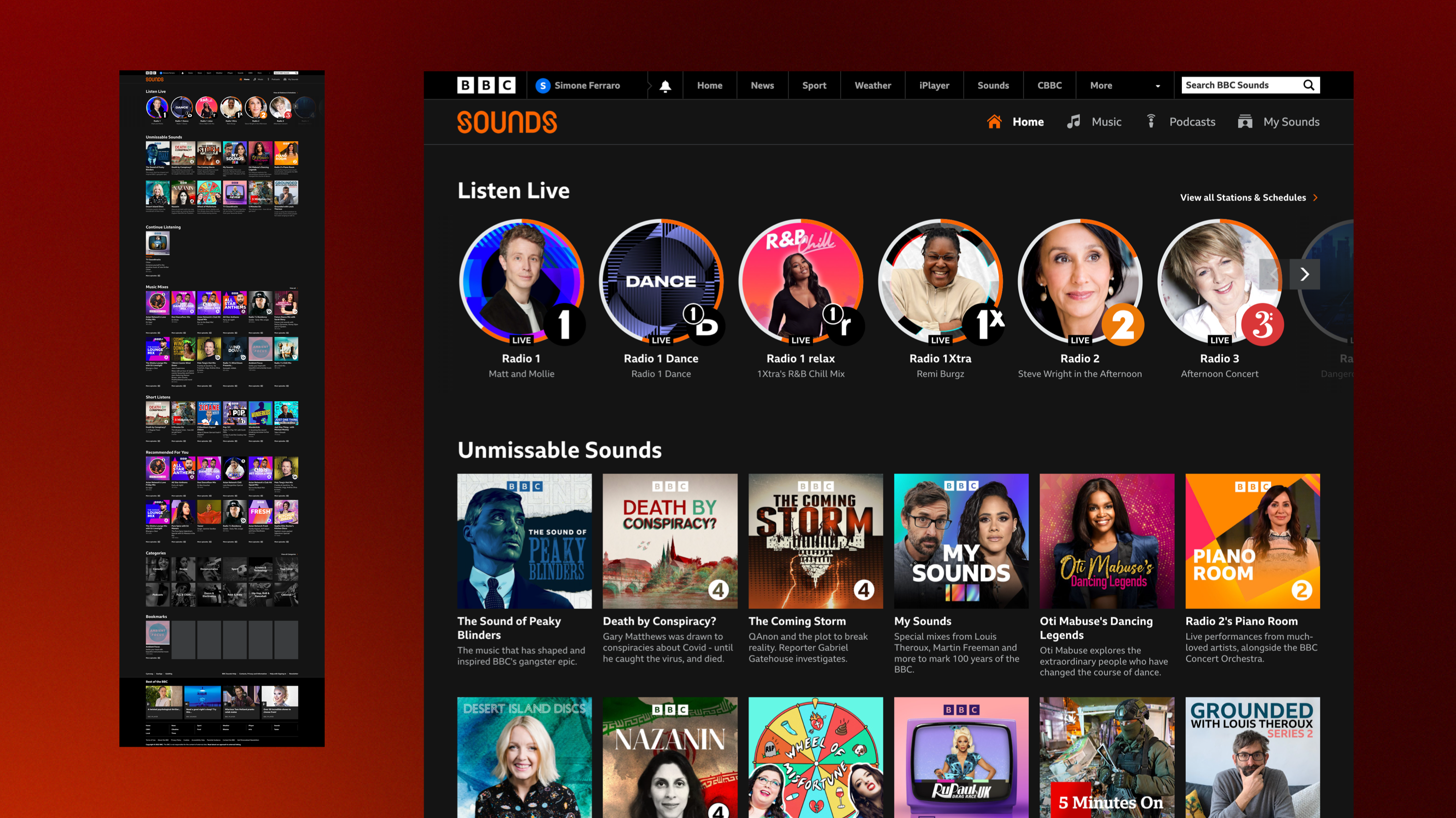
In 2018 BBC Sounds is launched to replace iPlayer Radio service and app for UK users.
THE CONTEXT
A New Role for the Homepage
In 2018 BBC Sounds is launched.
The main goal is to replace iPlayer Radio service and app for UK users, providing live radio broadcasts, audio on demand and podcasts through a new, unified and enhanced listening experience.
The first releases of BBC sounds mostly relied on a single page view that allowed to browse all the BBC Sounds contents from one single place.
Between 2019 and 2021 several iterations on the UI and the IA took place, until two more sections where added and A/B tested: Music and Podcasts.
Given the addition of two new sections, the overall purpose of the homepage had to be adapted accordingly.
A research work was then needed to identify user needs, validate assumptions and overall inform the redesign of the entire Homepage.
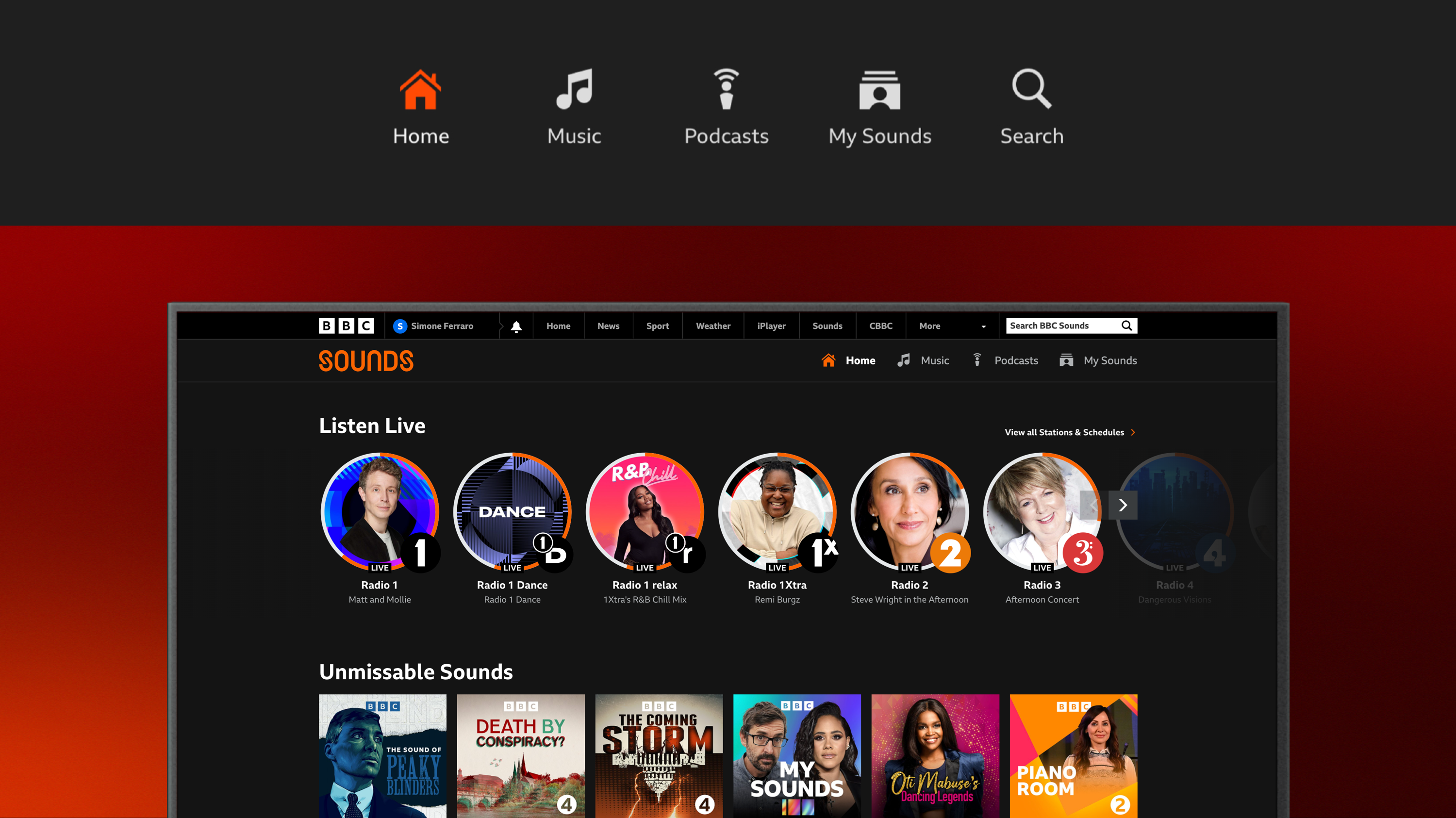
Given the presence of two new sections, the overall purpose of the homepage had to be adapted accordingly.
MY ROLE
Research, Report & Design
I took care with another team member of the entire research process.
Starting from recruiting and drafting the discussion guide to designing the IA-related exercises for the users, I ran the sessions, wrapped up the results and reported them back to the stakeholders among different departments.
I'm currently working at the redesign of the homepage according to the results of the aforementioned research process.
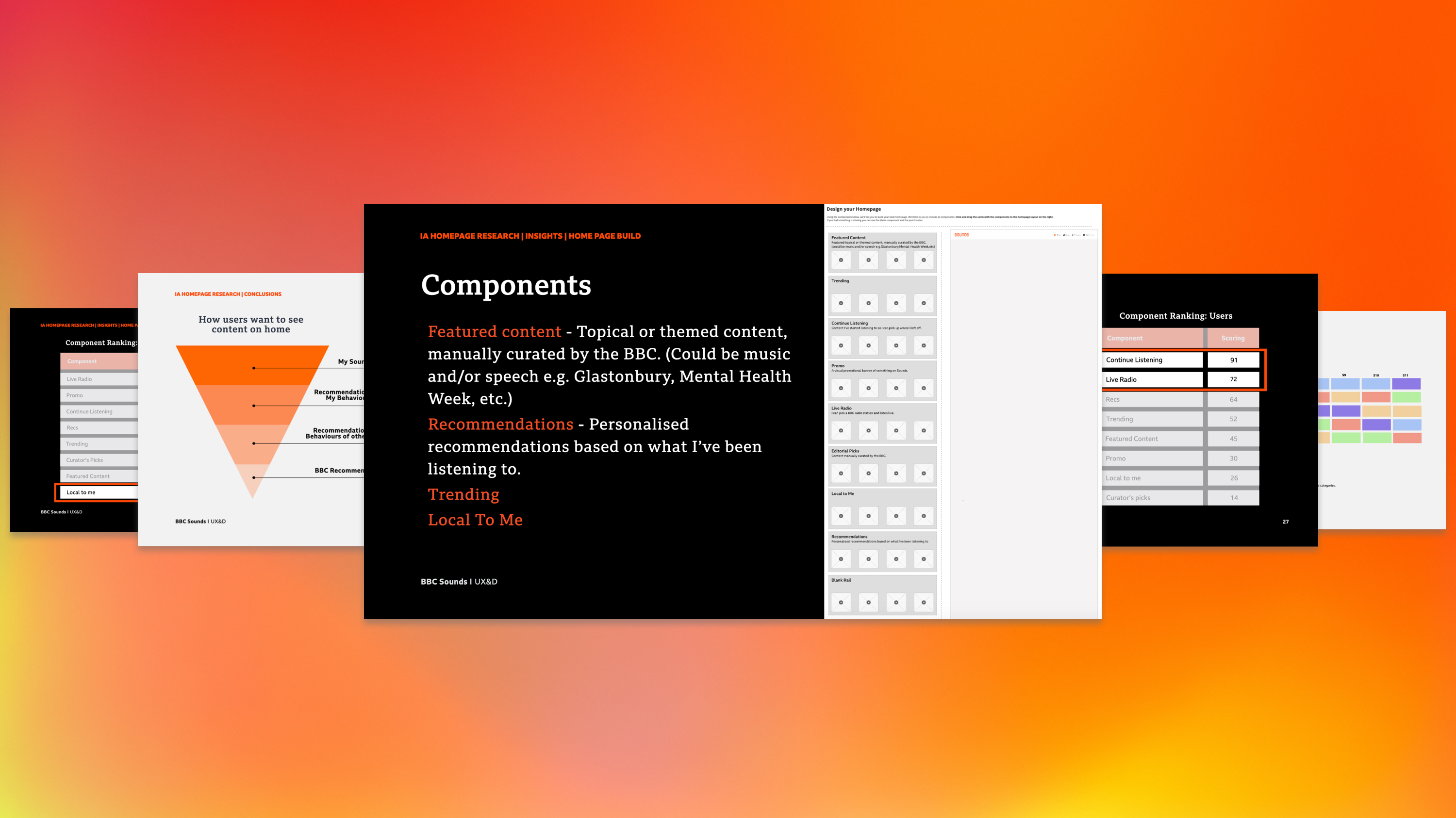
The insights collected were presented to stakeholders from different departments and informed the entire re-design process of the homepage.
ACTION
Qual Research in Full Effect
I ran a number of qualitative research sessions in person with both stakeholders and users.
Additionally 150 users where asked to complete an on line survey.
A detailed discussion guide was compiled and several interactive card sort and mapping exercises for the participants were designed.
In order to get key insights from our users and stakeholders on the new role of the homepage we asked the them:
- To tell us in their own words what the main expectation or focus of the homepage should be
- To rank a set of intents and functions the homepage should have.
- To describe in their own words their expectations around specific content types in the homepage (eg: Local To Me, Promo, Trending...)
- To build their ideal home page using a set of pre made components
The findings were distilled providing a huge amount of details and reported back to the stakeholders.
The Homepage needs to say to you: "this app is for me, this is a place where I want to spend time".
P10 - M, 30
IMPACT
Informing the design process
The insights collected were presented to stakeholders from different departments and bacame the foundation for the entire re-design process of the homepage.
Collecting information from the users and the stakeholders allowed to understand their mental models and expectations around the homepage and to redefine the role of the section optimizing the way contents are shown.
